User Experience
There are many things in games which effect the player's experience. The color choices, art style, and tone of the text all play an important role. The items in the game are also key for supporting the virtual world the players are entering (for example, the Lightside religious based games never had lightbulbs or soda cans in game, not even in the hidden picture game).
A big challenge in game design is how the user interface can effect the user experience. While a game has to have challenges and things for the player to figure out; those challenges should be in the gameplay, not in the UI. No one enjoys making extra clicks, clicking on the wrong thing, or having to hunt for something that they know exists, but can’t find.
Here are a few examples of UX and UI design challenges from some of the games I've worked on.
Verdonia
Verdonia was a kingdom building MMO with a complex set of resources and activities the player had to balance.
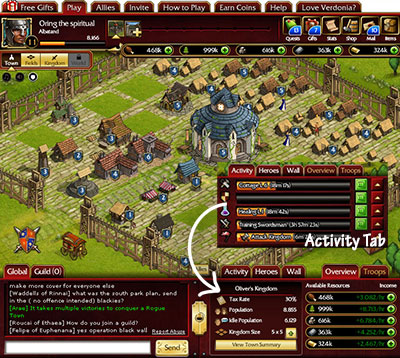
UI Challenge: Facebook’s canvas was only around 760x650, not a lot of space to display the city buildings, resources, production, activity with speed up buttons, chat, Facebook friend’s bar, other cities, and buttons for mail, quests, inventory, shop, etc.
Players needed quick access to these high priority items:
- The guild chat, high engagement and retention feature.
- The currently running activities (building, training, etc), key monetization feature with speedups.
- Facebook friends, viral and retention feature (takes a lot of screen space)
- One-click access to heroes, troops, defenses, and town status, for managing this complex system.
How the casual Facebook players would respond to an MMO was a consideration. To prompt players to always keep timed activities running, a panel was designed with a slot for each category of timed activity, with handy speedup buttons always on screen. (this was different than similar games which usually displayed 2 currently running activities with a 'more' button. and the player had to determine what was not on the list, and then go find the appropriate building to start a new activity.)
Solution: In the final UI design, the bottom area of the screen was split into 2 areas with tabs to choose the specific function needed:
- Social Items: Global Chat, Guild Chat, Friends
- Status Items: Activity, Troops, Heroes, Defenses, and Town Summary.
- The top of the screen had navigation, player score, and buttons for quests, shop, mail, etc.
Getting to Battle
Challenge: Make the game more mid-core rather than hard-core, ease Facebook players used to city building into Player vs. Player battles. Make it possible for them to come back to the game without losing so much that they would quit instead of rebuild.
Solution: Multiple features for protection and engagement
- Quest system guided players through building up city and troops
- Protected area where player could use their troops to harvest resources and battle game cities with clearly marked difficulty levels
- Player builds a specific building to enter PVP
- Player is prompted to build the PVP building at an appropriate level
- Upgradable Vault built by player protects resources
- Upgradable Keep built by player protects some of their troops while they are offline. Troops are still vulnerable if the player choses to attack using them
- Players can get troops and resources through viral activities with their friends
- Game prompts players to fight other players with a popup dialog for PVP players that suggests nearby cities of appropriate level for the player to attack. Initially it would offer easy targets to help the players win, and the range of difficulty increased as the player gained experience.
Result: Game was well received among the more casual Facebook player base. They initially engaged in city building, and retention was good. PVP players monetized as expected, with good retention.
Noah’s Ark
Noah’s Ark was a story and collection game where players navigated maps with obstacles (similar to Lightside's previous games) and reach a special location where they could get an animal. The main game goal was to collect animal pairs to fill the ark. Each map had 4-5 animals assigned to it, so players would replay the map and try to catch them all.
Catching an Animal
Challenge: communicate that using more and higher value treats changes the odds regarding which animal would be caught. Treats were an item to grind or purchase.
Process: It was vital for players to understand that using the treats had a direct impact on the odds of catching an animal - but displaying the odds as percentages would likely be intimidating to many players.
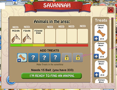
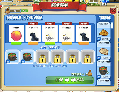
The initial mockup had one bar broken into segments and used color to show the odds (green for best odds, orange for worst). It also displayed plus and minus signs to show the player they could add or remove treats. The implementation in game had separate segments that did not touch, and due to time constraints, we user tested that version. Test results: It was unclear to the testers what the colors meant; in some cases they didn’t even notice the colors changing as they added treats. Some did not notice the column of treats to the right.
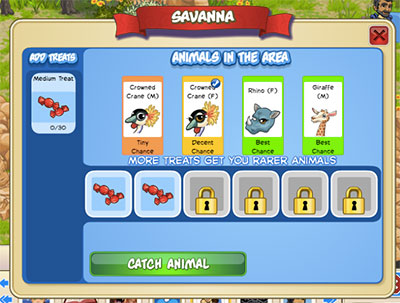
Solution: The color area was increased in size, and words added that reflected the chances. Column of treats moved to the left sized of the screen, and it was visually cleaned up with removal of the plus and minus signs and using a checkmark to indicate which animals the player already had.
Viewing the Collection
Players were able to place their animals on their homebase, and arrange them with flowers, trees, fences and other decor. That was great way to enjoy the animals and share with friends, but it was not good for tracking progress in collecting them all.
Challenge: Drive the 'collect them all' aspect of the game. Let players see exactly what they were still missing, and reward them for completed sets of animals.
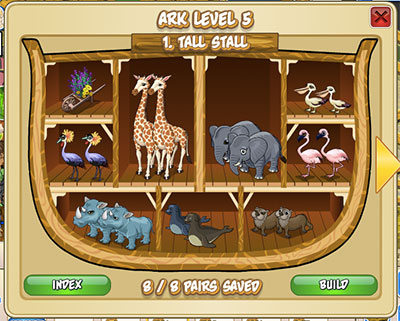
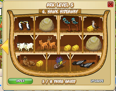
Process: Often games use a simple gridded catalog for that purpose, but I wanted to create an experience that supported the game's story. An ark ‘catalog’ was created with separate compartments for each pair of animals. The placement and size for each animal were defined in settings, allowing for the variety of animal sizes and shapes. Mousing over the hay bales would indicate what animal was missing.
Result: Players could access the ark catalog by clicking on the ark they were building on homebase, and see the ark filling with animals. They could also click on their friend's arks and see the their friend's progress.
There was an increase in players completing their collections and striving to get the rare animals.
Light the Way: The Bible
Reducing Friction
Offering players what they need when they need it has a great impact on the user experience and monetization. One extra click can change sales.
Challenge: When player runs out of energy, make choosing to buy or viral for it easy.
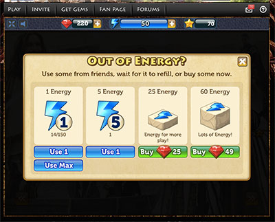
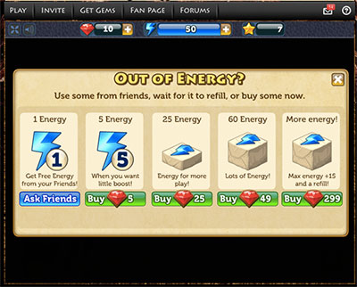
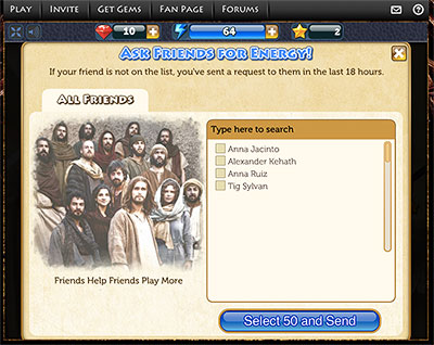
Solution: Increased sales from 'Out of Energy' dialog. When the player ran out of energy, the dialog allowed them to use energy from their inventory (if they had some), purchase energy, and ask friends to send them some (if they had not asked that day). While offering them energy from their inventory might seem counter-intuitive, the other scenerio was that the player would not buy energy, because they would want to go check their inventory first. That was a couple extra clicks, during which the player might choose to end the session and wait for more energy instead of playing on.
Challenge: Increase viral contact to lapsed players to reengage them.
Solution: When the player asked friends for energy, they could individually select their friends from a list, or they could just hit the ’Select 50’ button and have it ask (up to) 50 random friends for energy. The select 50 was not the first 50, but random, resulting in more friends being contacted.


